Having consistent, memorable branding is essential for any company, so we actively work with our clients to ensure that their sign design follows their brand guidelines to a T. Many of our clients (especially those who are franchises, institutions, or are in the petroleum industry) have prominent, well-established brands and retaining the integrity of their logos, colours, supporting graphics is a priority.
RECOGNIZABLE STOREFRONTS
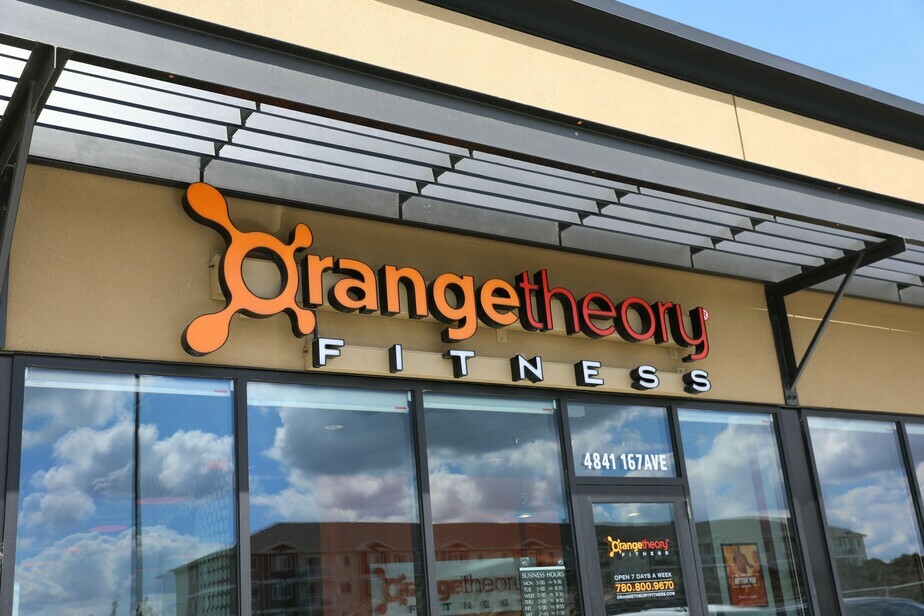
We recently finished up a project with the Orange Theory Fitness (OTF) in Edmonton, Alberta. We are all familiar with the striking orange storefronts, and it was a pleasure for us to receive the contract for the interior and exterior signage in several locations throughout the city.
CONSISTENCY AND BRAND INTEGRITY
For OTF, we began with the review of their company’s brand guide, taking into special consideration their pantone colours and supporting graphics. It is essential for our design team to understand the overall aesthetic of the brand in order to provide appropriate recommendations for interior and exterior options.
MATERIALS AND COLOUR MATCHING
Reproduction of the brand has to be flawless, this is why we go to painstaking lengths to ensure that brand colours are accurately matched no matter if we are looking at the sign inside our shop versus outside in natural light. Additionally, there are certain colours that don’t translate well once there is a light source involved, so we ensure that we test both illuminated and non-illuminated and explore alternative material or colour adjustments as needed.
We are proud of the clients we have worked with, executing signage installs with some of the most recognizable brands in Canada.
Contact us to learn more about how we can work with your brand!